Can you convert a video to pure css?
Twitter formerly known as X, a strange experience. It is the place where only the coolest of kids hang or so they say. The cool kids idle away their time smelling farts and fart like opinions. Sometimes I add my own to the mix but I usually lurk in the corners marinating in the warm miasma.
Not all flatulence is created equal. Some, is rather nice, interesting even, and dare I say it can be quite delectable. For example. Take this dude, jh3yy. What a guy.
He regularly shares cool examples of fancy css animations. At the time of writing his focus has been on css scroll animations. I guess there are some new properties that allow playing a css animation based on the scroll position. Apple has been using this on their marketing pages or so jhehy says. The property seems pretty powerful.
But how powerful?
This got me thinking...could it play a video as pure css?
a baseline
Before getting too crazy it may be best to get something simple working. The idea seems to be to slap scroll-timeline-name: someKindOfName; on a scrollable container. Then you can slap animation-timeline: --someKindOfName; on the element which animates. Simple enough.
Here is an example with 25 divs that animate a bunch of properties based on scroll.
Pretty cool unless....you are on Safari. Yup, Safari doesn't support this feature yet. Sad pandas. Too bad because it is pretty easy to use. That is fine. Just imagine for now that it animates as it scrolls all nice like.
The way this example works is pretty simple.
#v1 {
  position: relative;
  overflow-x: hidden;
  overflow-y: scroll;
  scroll-timeline-name: --section;
}
#v1 .container {
  height: 800vh;
}
#v1 .animated-div {
  animation-timeline: --section;
  position: absolute;
  animation-name: scrolly;
  animation-fill-mode: both;
  animation-timing-function: linear;
}
Absolutely position the scroll animated elements within a scrollable div. I added another div with a fixed height in the scroll view to control how much scrolling there is to play the full animation.
It may be worth trying a different method of animating via scroll position which works on all browsers. The idea is to use a tiny bit of js to set a css variable to what the current scroll position is. This can then be used to set a negative animation delay to "scrub" the key frames as the scroll position changes. This should work across browsers but is technically not "pure" css. I am going to use this technique moving forward for compatibility.
Here is the previous example with this method implemented.
The css is is a bit more complicated than the timeline version.
#wrapper {
  position: relative;
  overflow-x: hidden;
  overflow-y: scroll;
  --scroll: 0; // <== set via js
}
.scroll-height {
  height: 800vh;
}
.animated-div {
  position: absolute;
  width: 100px;
  height: 100px;
  animation-name: mySpicyBoyAnimation;
  animation-fill-mode: both;
  animation-timing-function: linear;
  animation-play-state: paused;
  animation-delay: calc(var(--scroll, 0) * -1s);
  animation-duration: 1s;
  box-shadow: 0 2px 22px #0008;
}
The secret here is that a negative animation delay will act as starting the animation earlier. This means that a delay of -.5s functions as starting in the middle of the animation. A css variable can be used to scrub the position of the animation and if set from js based on scroll works just like the timeline version. It is important to pause the animation and set the timing function to linear. You can use other timing functions but they all felt...wrong to me.
The js to set scroll position is pretty standard.
const targetDiv = document.getElementById("container");
targetDiv.addEventListener("scroll", () => {
  const scrollTop = targetDiv.scrollTop;
  const scrollHeight = targetDiv.scrollHeight - targetDiv.clientHeight;
  const scrollPercent = scrollTop / scrollHeight;
  targetDiv.style.setProperty("--scroll", `${scrollPercent}`);
});
This is a good time to stress test both versions to make sure they don't perform radically different before moving on. Ideally, it would be great to have millions of divs but I am going to guess that 1-5k is the upper limit.
Here are 500 divs.
There wasn't much difference between using timeline or the animation delay hack. Likely hitting a limit on a css animation limit. Looks like the budget is 500.
It would be fun to set the div positions to something more interesting than random numbers...maybe something more 3d?
What about positioning divs along the vertices of a 3d model based on scroll?
fancy pants adventure
Loading a model isn't too bad depending on format. I used .obj because it is easy to ignore other data I don't care about. I only need vertices. This little function will let me load a model and apply some optional scaling and rotation to the points. Ye'old gypity did the rotate vertex function for me.
const loadObjModel = (
  objData,
  [rx, ry, rz] = [0, 0, 0],
  [sx, sy, sz] = [1, 1, 1]
) => {
  const vertices: Array<{ x: number; y: number; z: number }> = [];
  const lines = objData.split("\n");

  lines.forEach((line) => {
    if (line.startsWith("v ")) {
      const [, x, y, z] = line.split(" ").map(Number);
      const v = rotateVertex(x, y, z, { x: rx, y: ry, z: rz });
      v.x *= sx;
      v.y *= -sy; // needed to flip y axis for js world
      v.z *= sz;
      vertices.push(v);
    }
  });

  return vertices;
};
Then slap this ugly as sin useMemo to generate styles indexing into the models.
const divStyles = useMemo(
  () =>
    Array.from({ length: count })
      .map(
        (_, index) => `
          .div${index + 1} {
            --x1pos: ${cx + m1[index % m1.length].x}px;
            --y1pos: ${cy + m1[index % m1.length].y}px;
            --z1pos: ${cz + m1[index % m1.length].z}px;
            --x2pos: ${cx + rnd(-200, 200)}px;
            --y2pos: ${cy + rnd(-200, 200)}px;
            --z2pos: ${cz + rnd(-200, 200)}px;
            --x3pos: ${cx + m2[index % m2.length].x}px;
            --y3pos: ${cy + m2[index % m2.length].y + 100}px;
            --z3pos: ${cz + m2[index % m2.length].z}px;
            --x4pos: ${cx + rnd(-200, 200)}px;
            --y4pos: ${cy + rnd(-200, 200)}px;
            --z4pos: ${cz + rnd(-200, 200)}px;
            --col1: ${gen()};
            --col2: ${gen(colorPalette2)};
            --col3: ${gen()};
            --col4: ${gen(colorPalette3)};
          }
        `
      )
      .join(""),
  [cx, cy, cz, width, height]
);
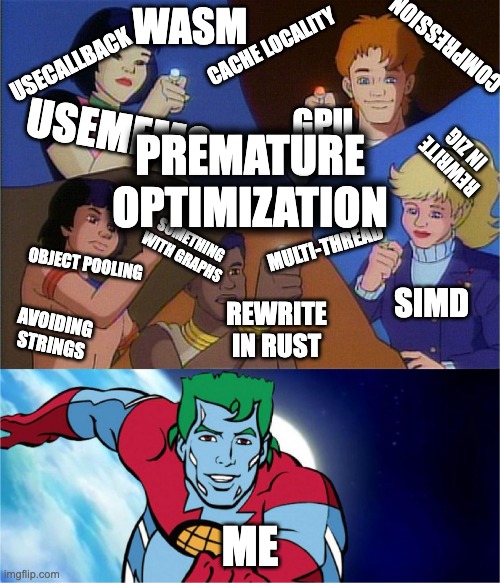
I didn't really need to use a memo. It works fine without it but I makes me feel like it is more efficient like I am saving electricity. Premature optimization makes me feel like captain planet.
The example looks pretty cool but it has over 600 points and can be sluggish. The models are fun, the mainecoon is my favorite.
The divs when rotated can be seen to be paper thin. This is normal and correct behavior when rendering rotated quads (2d planes) in 3d. There is a technique called billboarding which rotates the quads to always face the camera but it isn't something built into css.
The examples shown used only 4 keyframes. What if that number were bumped up a bit? like alot a bit....
What if a video were to be downscaled and then for each pixel a div were to be animated such that each keyframe was a pixel value corresponding to a frame of the video? It would be a shitload of keyframes. Megabytes of keyframes even. I am not sorry for what I am about to do to your browser.
near infinity and beyond
Ok. First. Make a videoUrlToArrayOfPixelData function. How exactly does one convert a video into pixel data? I don't know. There are all kinds of encodings. The simplest method is to just let the browser handle it. It turns out you can render a browser supported video format onto a canvas and then read back the pixels.
I want to be able to configure a sample frame rate to allow for optionally reducing the number of keyframes used. This would allow sampling 10 fps from a video running at 24 fps for example.
This is the code.
async function getUrlFrameData({
  url,
  targetWidth,
  targetHeight,
  scale,
  fps,
}: typestuff) {
  const video = document.createElement("video");
  video.crossOrigin = "anonymous";
  video.src = url;

  await video.load();
  await new Promise((resolve) => {
    video.addEventListener("loadedmetadata", resolve);
  });

  if (!scale) scale = 1;
  if (!targetWidth) targetWidth = video.videoWidth;
  if (!targetHeight) targetHeight = video.videoHeight;
  if (!fps) fps = 1;
  targetWidth *= scale;
  targetHeight *= scale;

  const aspectRatio = video.videoWidth / video.videoHeight;
  if (targetWidth / targetHeight > aspectRatio) {
    targetWidth = targetHeight * aspectRatio;
  } else {
    targetHeight = targetWidth / aspectRatio;
  }

  targetWidth = Math.floor(targetWidth);
  targetHeight = Math.floor(targetHeight);

  const canvas = document.createElement("canvas");
  canvas.width = targetWidth;
  canvas.height = targetHeight;
  const ctx = canvas.getContext("2d", { willReadFrequently: true });

  if (!ctx) {
    throw "failed to create context";
  }

  const frames: Uint8ClampedArray[] = [];

  video.currentTime = 0;
  const duration = video.duration;
  const interval = 1 / fps;

  while (video.currentTime < duration) {
    ctx.drawImage(video, 0, 0, targetWidth, targetHeight);
    const frameData = ctx.getImageData(0, 0, targetWidth, targetHeight).data;
    frames.push(frameData);
    video.currentTime += interval;
    await new Promise((resolve) =>
      video.addEventListener("seeked", resolve, { once: true })
    );
  }

  return { frames, width: targetWidth, height: targetHeight };
}
It would be good refactor to reuse the canvas and video elements. An interesting note is that this doesn't wait for fully loading the video. Instead, it will "seek" to each frame it is sampling from based on the input fps. The downside is that this ends up being a request waterfall as each seek restarts the stream. There is a way where you could cache multiple video and canvas elements and use them to make the frames loadable in parallel.
Today, I am not captain planet so this will be left as is.
Next is to reduce this giant array of raw frame data down into several big monster css animation strings, one for each pixel.
const pixelKeyframes: Array<string[]> = [];

for (const frame of frames) {
  for (let x = 0; x < width; x++) {
    for (let y = 0; y < height; y++) {
      const i = y * Math.floor(width) + x;
      const fi = i * 4;
      const r = frame[fi];
      const g = frame[fi + 1];
      const b = frame[fi + 2];
      const a = frame[fi + 3];
      const hex = rgbToHex(r, g, b);
      if (!pixelKeyframes[i]) {
        pixelKeyframes[i] = [];
      }
      pixelKeyframes[i].push(hex);
    }
  }
}

const css = generateCssKeyframes(pixelKeyframes, frames.length);
This step in theory could be removed but I found it easier to step away from raw bytes. The generate key frame function was helped in part by gypity. I say this because I hate the code it made but it worked after a few tweaks.
In the previous examples I was in react land. I got sick of it and decided to create the html in plain js. I tried css grids as I wanted easy scaling and aspect ratio control. It didn't work well. Instead, I had to write way too much js to position it all just right regardless of video source size, downsampled size, container size, or screen size. It works fine as long as you don't resize your window.
Here is the bit which positions the divs and sets their animation name.
for (let index = 0; index < width * height; index++) {
  const gridItem = document.createElement("div");
  gridItem.id = `pixel-${index}`;
  gridItem.style.animationName = `pixel-${index}`;

  const x = (index % width) * scaleX + targetWidth / 2 - (width * scaleX) / 2;
  const y = Math.floor(index / width) * scaleY + targetHeight / 2 - (height * scaleY) / 2;
  gridItem.style.left = `${x}px`;
  gridItem.style.top = `${y}px`;

  gridContainer.appendChild(gridItem);
}
That is some ugly ass code. Keep in mind the pixels are in a flat array hence the indexing.
Here is a video with a target fps of 5, downscaled 98%, and rounded pixels. It may take a few seconds to load if you are on chrome.
Speaking of chrome. Safari is much faster. Like 30x faster, maybe more. It both handles more animated divs but also can handle 100x larger css strings. Chrome will crash pretty quick when the fps or resolution is bumped up. It doesn't matter which one since it seems that the css string is too big for chrome to handle. Safari also doesn't restart the request stream when seeking video playback so parsing the video is also much faster.
It is pretty hilarious that Safari owns chrome so bad here. It isn't even a competition. This example is scaled up to 8 fps at 6% native resolution but be warned, it sometimes crashes on chrome. Here is a video for those who cannot run it.
By dropping the resolution the fps can be cranked up to native speed. Here is an example at a lower resolution. The animation is looped without the scroll control. Again, this may crash chromium browsers but should be fine on mobile safari. It will take up to 30s seconds to load on chrome. You can tell that sometimes the playback glitches out a bit. This is a little less obvious when controlled by scroll position.
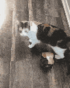
My partner sent me a video of their cat Zombie flipping out and I thought it would be a good example to cssify. Hilarious. If you hold your phone away, it almost looks like a cat. This also shows how the scaling works with different aspect ratios. A scrolly version is here too.
It is worth mentioning that the css generated for this is huge but not stupidly yuge. The examples above can hit almost triple digit megabytes. At native 1080p, let alone 4k, it runs in the many hundreds of mb. The bottle neck seems to be css string size along with the number of animated divs with Safari doing the best.
One optimization idea to reduce the size of the css string is to skip keyframes if the pixel value is unchanged frame to frame. This could provide a huge reduction depending on the video. My gut says a 60-80% reduction depending on desired quality is a reasonable expectation.
const keyframes: string[] = [];

pixelKeyframes.forEach((frameColors, pixelIndex) => {
  const pixelAnimation: string[] = [];
  let previousColor: string | null = null;

  frameColors.forEach((color, frameIndex) => {
    if (previousColor === null || !isColorSimilar(previousColor, color, .96)) {
      const percent = ((frameIndex / (totalFrames - 1)) * 100).toFixed(2);
      pixelAnimation.push(`${percent}% { background: ${color}; }`);
      previousColor = color;
    }
  });

  const pixelKeyframe = `
      @keyframes pixel-${pixelIndex} {
          ${pixelAnimation.join("\n")}
      }`;
  keyframes.push(pixelKeyframe);
});

return keyframes.join("\n");
At a 96% similarity check it does cut css video size in half. However, there is some artifacting now. I found that putting a limit on the number of frames skipped reduces the artifacts but doesn't eliminate it. I am sure sampling more pixels when comparing between frames would help. However, it still doesn't solve the problem of being overall slow to render.
Like, I still need to have a bunch of divs carefully positioned. Each div has its own animation with keyframes. It doesn't feel like pure css. Too much html. If only there were some kind of way to render a bunch of pixels on a single div using only css and keyframes. if only...
going full circle

Member box shadows? I member.
Take a div, add a big'ol box shadow string, and then animate the string across keyframes. Each key frame is a frame of the video. This should be much simpler than the before. And it will be pure css. One should be able to slap a class on a div and watch the video go or scroll to animate.
Let's see if it works.
This is much faster on both chrome and safari. It can handle almost 4x the resolution and framerate. Interestingly, chrome does better with box shadow rendering so if it doesn't crash parsing the css string it ends up being smoother than safari.
The code is cleaner too.
  const boxShadows: string[] = [];

  for (let y = 0; y < height; y++) {
    for (let x = 0; x < width; x++) {
      const index = (y * width + x) * 4;
      const r = frameData[index];
      const g = frameData[index + 1];
      const b = frameData[index + 2];
      const hexColor = rgbToHex(r, g, b);
      boxShadows.push(`${x}px ${y}px ${hexColor}`);
    }
  }

  const step = (frameIndex / (totalFrames - 1)) * 100;
  return `${step.toFixed(2)}% {box-shadow:${boxShadows.join(",")};}`;
Creating the box shadow keyframes is pretty simple assuming each shadow is a single pixel.
The pure css string for this is as follows.
const css = `
  .cssToVideo {
    position: absolute;
    top: -1px;
    left: -1px;
    overflow: visible;
    width: 1px;
    height: 1px;
    animation: cssToVideo linear ${duration}s both infinite;
    ${
      animateWithScroll ? `
      animation-duration: 1s;
      animation-delay: calc(var(--scroll, 0) * -1s);
      animation-play-state: paused;
    ` : ``
    }
  }
  @keyframes cssToVideo {\n ${cssKeyframes.join("\n")} \n}
`;
Now strap that bad boy cssToVideo class onto a div and you are off to the races. There is a little more glue code which adds divs, css, scroll listener, etc but the above alone will play a pure css video. So stupid. I love it.
But I know what you are thinking. Right now you have a bunch of videos which are begging to be transformed into pure css. You want a little app where you can upload a video and preview different resolutions, fps, etc, which will spit out a css string for your video just like all those other online css tools. Say no more fam.
Ok, the app was a pain to make. I am going to skip "how" it was made. What is important is that you can now convert videos to pure css strings to use on your startup's next landing page. Don't worry about the fact most of your user's browsers will crash. That isn't important right now. What is important is that people understand what you stand for. You are willing to use the most esoteric and nonsensical technology for no practical reasons but to send a message to your customers and your competition, especially the competition. Style over substance wins the battle 50% of the time every time. Never change.
Perhaps if pure css videos catch on, I will update the app to include more features. Maybe even create special file format for it called .vibcss along with an RFC because god knows the web needs more "standards". It is worth noting that on iphone's there seems to be a hard limit on resolution but not as much css size. So as long as the resolution is small enough, you should be able to have hundreds of megabytes of css.
extra mile
When I showed my buddy the app he was like, "should dump playbakc to gif". I assumed he meant that there should be a way to save your cssified video into an animated gif. To keep with the spirit here, the goal is to take the previously generated css string and convert it to an animated gif. There is a gif.js library with a canvas like api for creating gifs. This is perfect because all the pixel data is in the css string if I can just parse it out. I tried getting gypitydoodah to AI me up some parsing code but it failed.
When in doubt, split split slice, map, split slice map map, and finally map again.
function extractBoxShadowColorsAsUint8Arrays(css: string) {
  return css
    .split("@keyframes cssToVideo {")[1]
    .split("box-shadow")
    .slice(1)
    .map((shadow) =>
      shadow
        .split(" #")
        .slice(1)
        .map((pixel) => pixel.split(/,|;/g)[0])
        .map((pixel) => hexToRgb(pixel))
    )
    .map((frame) => {
      const raw = new Uint8ClampedArray(frame.length * 4);
      frame.forEach((pixel, i) => {
        raw[i * 4] = pixel[0];
        raw[i * 4 + 1] = pixel[1];
        raw[i * 4 + 2] = pixel[2];
        raw[i * 4 + 3] = 255;
      });
      return raw;
    });
}
Is this fancy? No. Is it Brittle? Probably. Does it work? kinda.
I kept the original gyptiy function name extractBoxShadowColorsAsUint8Arrays because it reminds me of java. sips coffee
To support keeping the preview resolution scale I need to render an image to another canvas scaling it up making sure to turn off image smoothing to keep the pixelated style. Graphics people call this kind of image scaling nearest neighbor.
function framesToGif(
  frames: Uint8ClampedArray[],
  originalWidth: number,
  originalHeight: number,
  scaleFactor: number,
  delay: number
) {
  return new Promise<string>((resolve, reject) => {
    const width = originalWidth * scaleFactor;
    const height = originalHeight * scaleFactor;

    const originalCanvas = document.createElement("canvas");
    const scaledCanvas = document.createElement("canvas");
    const originalCtx = originalCanvas.getContext("2d", {
      willReadFrequently: true, // <-- hint that we read...alot
    });
    const scaledCtx = scaledCanvas.getContext("2d", {
      willReadFrequently: true, // <-- idk if we read but gif.js may
    });

    originalCanvas.width = originalWidth;
    originalCanvas.height = originalHeight;
    scaledCanvas.width = width;
    scaledCanvas.height = height;
    scaledCtx.imageSmoothingEnabled = false; // <-- use nearest neighbor

    const gif = new GIF({
      workers: 2, // idk if this is good number
      quality: 10, // gpt set these values, jesus take the wheel
      width: width,
      height: height,
    });

    const imageData = originalCtx.createImageData(
      originalWidth,
      originalHeight
    );

    frames.forEach((frameData) => {
      imageData.data.set(frameData);
      originalCtx.putImageData(imageData, 0, 0);
      scaledCtx.drawImage(originalCanvas,0,0,originalWidth,originalHeight,0,0,width,height);
      gif.addFrame(scaledCtx, { delay, copy: true }); // gpt forgot the copy: true here >.>
    });

    gif.on("finished", function (blob) {
      resolve( URL.createObjectURL(blob));
    });

    gif.render();
  });
}
Then to put them together.
export async function cssToGif(
  css: string,
  width: number,
  height: number,
  scale: number,
  fps: number
) {
  const frames = extractBoxShadowColorsAsUint8Arrays(css);
  const url = await framesToGif(frames, width, height, scale, (1 / fps) * 1000);
  window.open(url);
}
So simple. Now, you too can convert a video into pure css and then convert that css into a gif. It is basically a video to gif app. It is critically important we don't skip the pure css step as style matters.
Here is a link to the app again. Go ahead, make some gifs. Don't worry. Your browser loves css, like alot. I promise.
I will leave you with Zombie donning her helm before an attack as a gif made from css made from a video.
Until next time.